English version follows:
ソラコムが提供するサービスが広がり、ソラコムプラットフォームを利用するユーザーが多様化する中、ユーザーから「利用している様々なサービスの概要をもっとトップダウンで知りたい」という声を聞くことが多くなってきました。
そこで、「Xサービスを簡単に把握したい」「Yサービスの利用状況を把握したい」というユーザーからの要望を集約し、ダッシュボードを開発しました。ユーザーコンソールに新しいランディングページを導入し、パネルやウィジェットでソラコムのサービス状況を俯瞰できるようにしようと考え、ダッシュボードプロジェクトは生まれました。
スコープの定義
ダッシュボードプロジェクトの主な焦点はインサイト(観察と発見)です。どのような情報を含めることができるのでしょうか、ということを考えました。
幸いなことに、ユーザーコンソールの多くの画面には様々な貴重な情報が散りばめられており、ダッシュボードのパネル候補をすぐに絞り込むことができました。例えば、最新の課金情報、SIMの通信量、エラーログなどです。
ダッシュボード・パネルの候補は、おおよそ次のようなカテゴリーに分類されます。
- サービスの状況をすばやく把握できるようにする。
- 最近のログメッセージ、エラー、問題を表示する
- 課金やサービスの利用が予想通りであったかを確認するための方法。
- 未使用のソラコムサービスを発見する
チームはワイヤーフレーム(設計図)を作成し、ダッシュボードのデザイン候補の忠実度の高いモックアップに移行しました。
問題点の洗い出し ~ 開発の裏話
SORACOMユーザーコンソールは、実はSORACOMのAPIのクライアントとして実装されています。
ダッシュボードに関しても、API経由でデータを取得することになるわけですが、Development meeting の中で最初に提起された問題の1つは、多くのAPIを使用して同時にデータを取得する際のパフォーマンスをどのようにして確保するかということでした。1回のページロードで最大10以上のAPIを同時に呼び出す可能性がある要件は、そうそうあるものではありません。
これを解決するために、私たちはダッシュボードレベルでキャッシングを実装し、ダッシュボードの読み込みが常にパフォーマンス良く行われるようにしました。特にトラフィック量の計算やログの取得など、大きな計算を行うAPIでは、重要なAPIレスポンスを一定期間キャッシュしています。信頼性を向上させ、キャッシュスタンピングを防ぐために、xfetchアルゴリズムにヒントを得たロジックで、キャッシュをリフレッシュする際にランダム性を追加しました。
さらに、私たちがアクセスする必要のある、より高度な情報もありました。このデータのほとんどは、既存の API を複数回呼び出すことで取得できましたが、SIM とサブスクリプションに関する要約データを提供する新しい Dashboard API を実装する方がより理にかなっていました。
これにより、多くの複雑なロジックを本来あるべきバックエンド API に移動し、ダッシュボードのクライアント側レンダリングを簡素化することができました。
私たちは、複雑で多様なデータを含むさまざまな種類のパネルを含めることを計画していました。そのパネルをどのように構築し、さまざまなブラウザ幅で使用できるようにするか等々です。幸いなことに、私たちは独自のデザインシステムを活用することができ、最初のダッシュボードデザインを非常に迅速に実装することができたので、チームは記録的な速さでダッシュボードを用意することができました。
そして、ダッシュボードの追加!
最終的には、ユーザーコンソールの新しいランディングページとして利用できるようになりました。
このプロジェクトの特典として、最近ユーザーコンソールに導入された新しいダークモードとシームレスに動作することを確認し、ユーザーコンソールのすべてのページに新しいパンくずコンポーネントを導入して、ダッシュボードに直接すばやく戻ることができるようにしました。
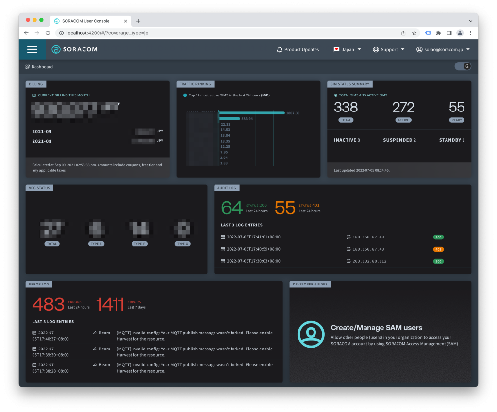
新しいダッシュボードでは、お客様のアカウントに関する以下のような概要が一目で分かるようになっています。
- 現在の課金情報および過去2ヶ月間の課金履歴
- アカウントに登録されているSIMの総数、および各SIMのステータスごとのSIMの数の概要
- お客様のアカウントにある仮想プライベートゲートウェイ(VPG)の数の概要
- お客様のアカウント情報(オペレーターID、Eメールなど)
- ソラコムプラットフォームの最新アップデート情報、製品またはサービスのアップデート情報
今後の予定
すでに、追加のパネルを作成中で、リリース前のテストと最適化を待っているところです。また、パネルの並べ替えのテストも開始しており、特定のパネルの有効・無効を設定することで、ユーザーごとにフルカスタマイズされたダッシュボード体験ができるようになる予定です。
ぜひご期待ください!
Adrian
Overview
With the ever expanding range of services Soracom offer and the increasingly diverse range of users utilising the Soracom platform, something we have been hearing more and more from users was the desire to have a more ‘top down’ overview of the various services being used.
With numerous user feature requests along the lines of “How do I get a quick overview of X service?” or “How do I quickly see what my usage of Y service is?” we took the opportunity to try and address these requests.
With this in mind, the Dashboard project was born, with the idea to introduce a new landing page for the User Console that provides an overarching insight on the status of Soracom services through a series of panels or widgets.
Defining the scope
With insight being the main focus of the dashboard project, what would be the scope of the information we could include?
We already had a wide range of information available throughout the many screens of the user console and were able to shortlist potential dashboard panels quite rapidly. These included information such as latest billing, SIM traffic and error logs to name a few.
The potential dashboard panels roughly fell into one of the following categories:
- provide a quick insight on the status of a service
- surface any recent log messages, errors or issues
- provide a way to make sure billing or service usage was as expected
- discover unused Soracom services
The team proceeded with creating wireframes and moved to high-fidelity mockups of potential dashboard designs.
Problems discovered
One of the first potential issues that was raised in one of our many development meetings was how do we ensure that retrieving data from so many disparate APIs simultaneously is performant? It’s not often there is a requirement to potentially call up-to 10 or more APIs simultaneously on a single page load.
To solve this, we implemented caching at the dashboard level to ensure the dashboard loading was always performant. Some critical API responses we’re caching for a specific time period, especially any API which performs big calculations such as calculating traffic volume, getting logs etc. To improve reliability and to prevent cache stampeding we added some randomness when refreshing the cache, logic inspired from xfetch algorithm.
There was also additional high-level information we needed access to. While we could retrieve most of this data through multiple calls to existing APIs it made more sense to implement a new Dashboard API to provide summary data about SIMs and subscriptions.
This allowed us to move a lot of complex logic to the backend API where it belonged, simplifying the client side rendering of the dashboard.
We planned to include different types of panels with complex and varying data – how do we build the panels and ensure they are useable across different browser widths.
Luckily we could leverage our own Design System and were able to implement the first dashboard designs quite rapidly allowing the team wire together the Dashboard in record time.
Result
The end result is now available and is the new landing page for the user console.
As a bonus part of this project we also ensured it worked seamlessly with the new Dark Mode recently introduced to the user console, and we introduce a new breadcrumb component across all pages of the user console allowing you to quickly navigate back to the dashboard directly.
At launch the new Dashboard will give you an at-a-glance overview of your account, such as:
- Your current billing information as well as billing history from the past 2 months
- A summary of the total number of SIMs in your account and number of SIMs by each SIM status
- A summary of the number of Virtual Private Gateways (VPGs) in your account
- Your account information, such as Operator ID, email, etc.
- Information about the latest updates to the Soracom platform and product or service updates
Future plans
We already have additional panels in progress and awaiting testing and optimisation before release. We also have started testing the ability to re-arrange the panels, and plan to allow users to enable or disable specific panels providing a full custom dashboard experience for every user.
Stay tuned!
Adrian